
What is flex in CSS? | Uses of the flex in CSS?
Friends, The flex property sets the flexible length of flexible items. Note: If the element is not a flexible item, the flex property has no effect. and today we are going to learn what is CSS Flexbox Properties and if do you not know how to use CSS Flexbox, then today we will tell you how to use CSS Flexbox, very good properties are used for CSS FlexBox Module. FlexBox Module can be used to create Responsive Web Design. If you also want to make the website responsive then you can use the flexbox model. We can respond easily.
When we add a lot of images, text, boxes, etc. things only on the left side, right side, and center in the same line, and after making a box, adding another box starts in the bottom line, etc. We use CSS flex for things like using the property. We can also use the flex property by applying the flex class only with HTML, after which we do not need to write CSS or we use flex by applying the flex class in CSS.
Uses of the flex in CSS?
The flex property is used to lengthen the child element of the flex container in this number (flex-grow, flex-shrink) or by the measurement unit (flex-basis). The flex-grow, flex-shrink, and flex-basis values of these properties are used on the flex property.
Some Effective Properties for Flex Box Model
- display
- flex-flow
- align-items
- justify-content
- flex
- flex-direction
- flex-wrap
- align-content
- align-self
- order
- flex-basis
- flex-grow
- flex-shrink
What exactly is CSS the term flex-direction?
By using CSS flex-direction, it is possible to keep every box within the same line i.e. from left and right to left, and one boxes from bottom to top or from bottom to top is known as the flex-direction. Display Flex is utilized with flex-direction. Flex-direction is used when we are using the flex function with it.
Also Read: How to create a website using HTML and CSS
Flex direction row
If we wish to begin the box in the same direction as the left, we will use the row that has flex-direction. To provide flex-direction using HTML only within the HTML class, we utilize the row by using the d-flex. In the end, we do not have to write CSS Another way is to apply CSS to provide flex-direction is row uses.
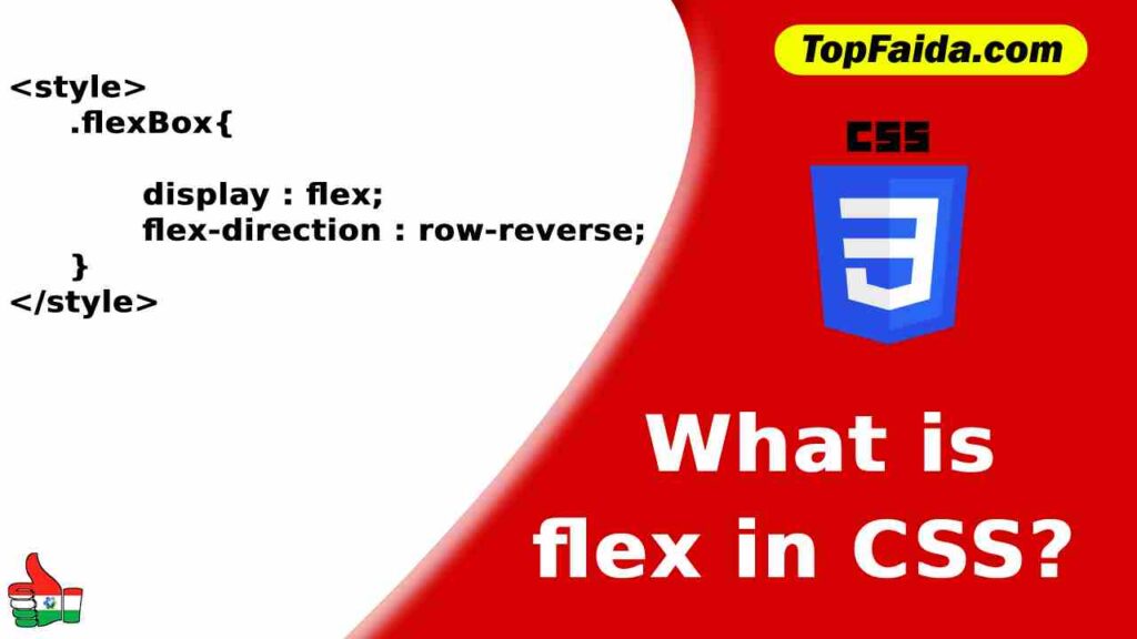
Row reverse in flex-direction
If we wish to begin the box on the right side, instead of the left side, in the same direction, then we will use the row-reverse flex-direction. For the row reverse flex-direction using HTML only, we can employ row-reverse using flex in the HTML class, then we don’t have for writing CSS. If we would like to offer row reverse using CSS, then we can use flex-direction row-reverse in CSS using HTML class. give.
Columns with flex direction
If we wish to keep a second box after one box is placed in the following line i.e. from top to bottom then we can use a column with flex-direction. Utilize flex-column within the HTML class to supply flex-direction columns exclusively by HTML flex-direction column; use.
Also Read: Beautiful GridView Design Using Custom CSS In Asp.Net
Column reverse flex direction
If a box must be placed following a single line or to ensure it is positioned from bottom to top then we will use the flex-direction column. To provide flex-direction column in HTML, only the flex-column class to provide the flex-direction column using CSS flex-direction column; uses.
CSS Justify Content
With Justify Content in CSS, we can assign each box a left, center, or right space and an equal gap between several boxes and the equal space within the box.
Justify Content Start
With Justify content-start, we are able to align each box towards the left. To align the box to the left by HTML only we use justify-content-start with d-flex in the HTML class To align the box to the left by CSS justify-content: flex-start; makes use of.
Also Read: What is a Z index in CSS? and how is it used?
Justify Content Center
With the justify-content center, we can place many boxes in the center of the page, to center align the box only by HTML, we write justify-content-center with d-flex in an HTML class. To align the box by the center, we use CSS justify-content center; use.
Simply re-insert content and end the Flex
With flex-end, we can put boxes on either the right-hand side or at the end of the pages. Utilize justify-content-end using d-flex in the HTML class to ensure that the box is in right alignment or last place using HTML alone. To align the page, use CSS justify-content end; make use of.
Space between content should be resized.
If we would like to create equal space between multiple boxes, for that reason, we can utilize justifying space between content. To give an equal gap inbox only by HTML use justify-content-between with d-flex in HTML class to give an equal gap inbox by CSS justify-content: space-between; make use of.
Also Read: How to add CSS in HTML?
Content that is justifiably categorized about
If we are looking to give equal space around many boxes, we will utilize justify space for content around. To create equal gaps within a box, we must make use of justifying content with the d-flex attribute in the HTML class to create a gap in the box with CSS justify-content space-between; use.
CSS align-items
Text, numerous large and small boxes, and other elements can be created at the beginning at the very top of the page in one line. It is possible to keep all the boxes on the page beginning from bottom to top, or you can start all boxes from the bottom part of the webpage.
Align the items to flex to start
It is possible to start numerous small boxes or text at to the very top. aligning items using flex start. you can also choose to use align-items-start instead. To have HTML start from the top, use align-items start with the d-flex attribute in the HTML class. This will start at the top of the page using CSS align-items: flex-start; uses.
Also Read: How to add a background image in CSS?
Align items in the center
By aligning items to the center, we can place a small box in both positions. to maintain center alignment of several boxes that use HTML employs align-items center using d-flex within HTML class CSS to center the box by aligning items: center and makes use of.
Align the items at the flex-end
By using the flex-end, we can place a variety of smaller and larger boxes from the top to the bottom position in the middle of the box. HTML makes use of align-items to end to put all boxes towards the bottom of the box. CSS uses align-items: flex-end uses.
Align items stretch
By aligning items stretching to keep the dimensions of the child’s box within the main box in line with the size of the main box. This is in which the contents of the child’s box remain at its location, however, the color of the border and background colors of the primary box become stretched. Utilize align-items-stretch within the d-flex using box to align-items-stretch exclusively by HTML and align-items to stretch the child-box with CSS. Makes use of.
Also Read: Which is the Correct CSS Syntax?
CSS Flex wrap
If we create a lot of boxes, once the box is completed within a single line, we are able to break the box in accordance with the space on the second line and keep it in the same line, or we flip the entire box back to one line. can drive.
No-wrap Flex wrap
With flex-wrap, no-wrap, it is possible to keep the boxes in one line once the box has been completed in one line. This ensures that the box doesn’t break in the second line due to HTML the flex using d-flex in order for keeping the box on the same line. – nowrap is utilized to make use of CSS for keeping the box in the same line. Flex-wrap is a no-wrap option; makes use of.
Flexible wrap
With CSS flexible wrap allows us to split the box on just one line once it’s finished in the following line. HTML uses flex-wrap and d-flex within this box in order to tear it on the next line. CSS wrap; utilizes.
Also Read: How to link CSS to HTML with 3 methods?
CSS Flex wrap reverse
With flex-wrap reverse, you can begin the box starting from the second line and ending at the first line. That means that the box begins at the end of the line and does not start from the beginning of the line. For running the box upside down using HTML only, you must make use of a box that has d-flex inside it. Turn the box upside down, use HTML and CSS flex-wrap reverse uses.
2 thoughts on “What is flex in CSS? | Uses of the flex in CSS?”